0 Comments
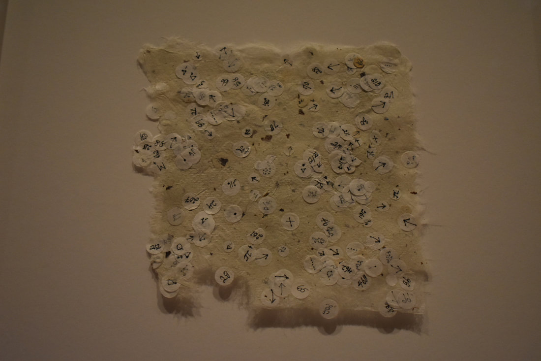
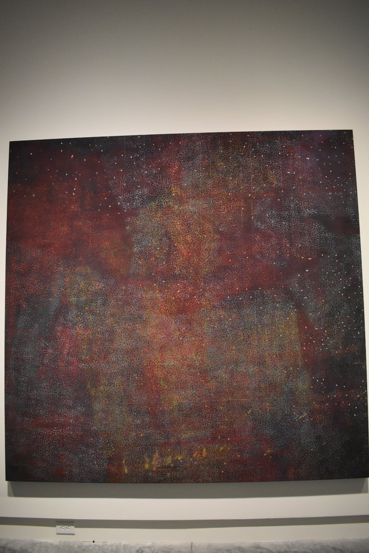
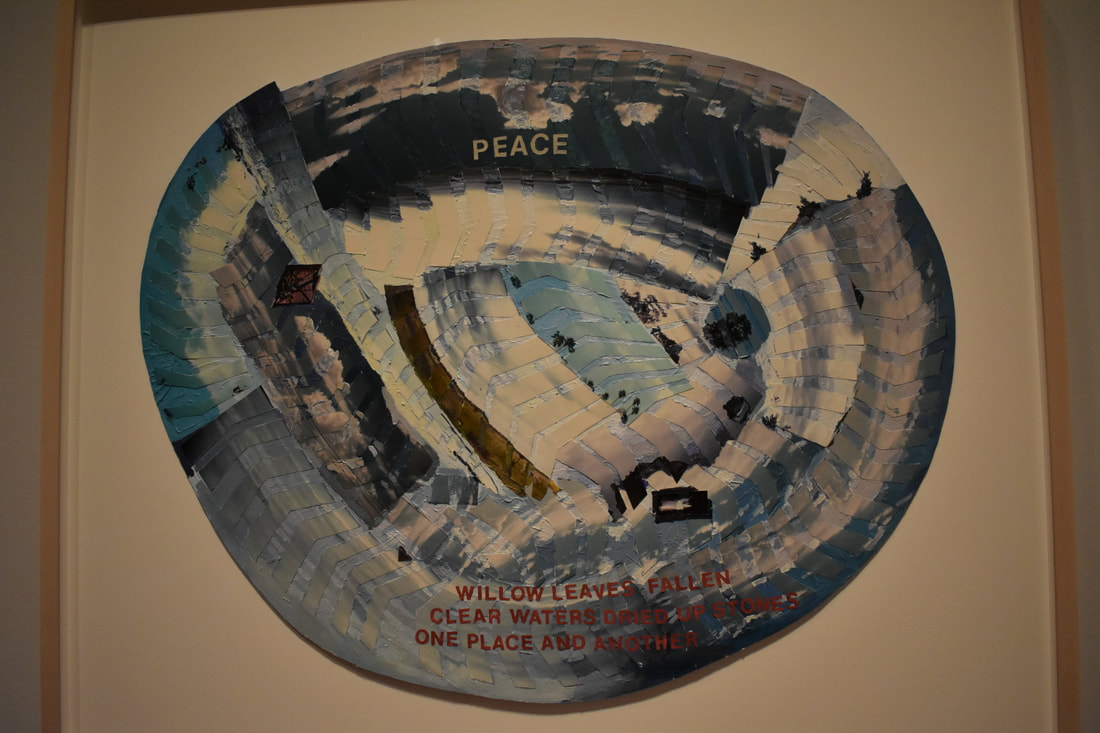
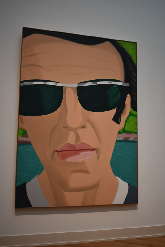
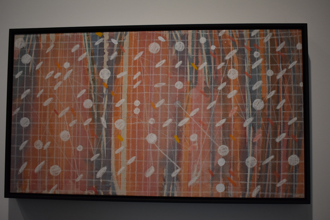
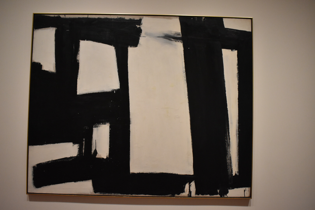
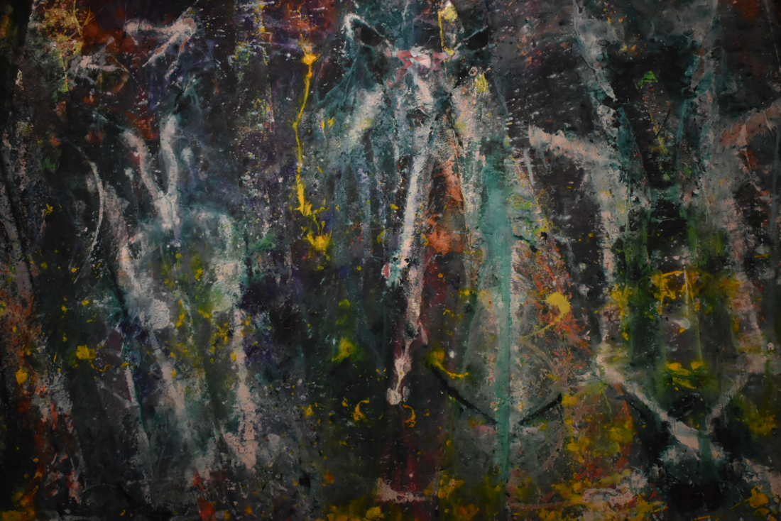
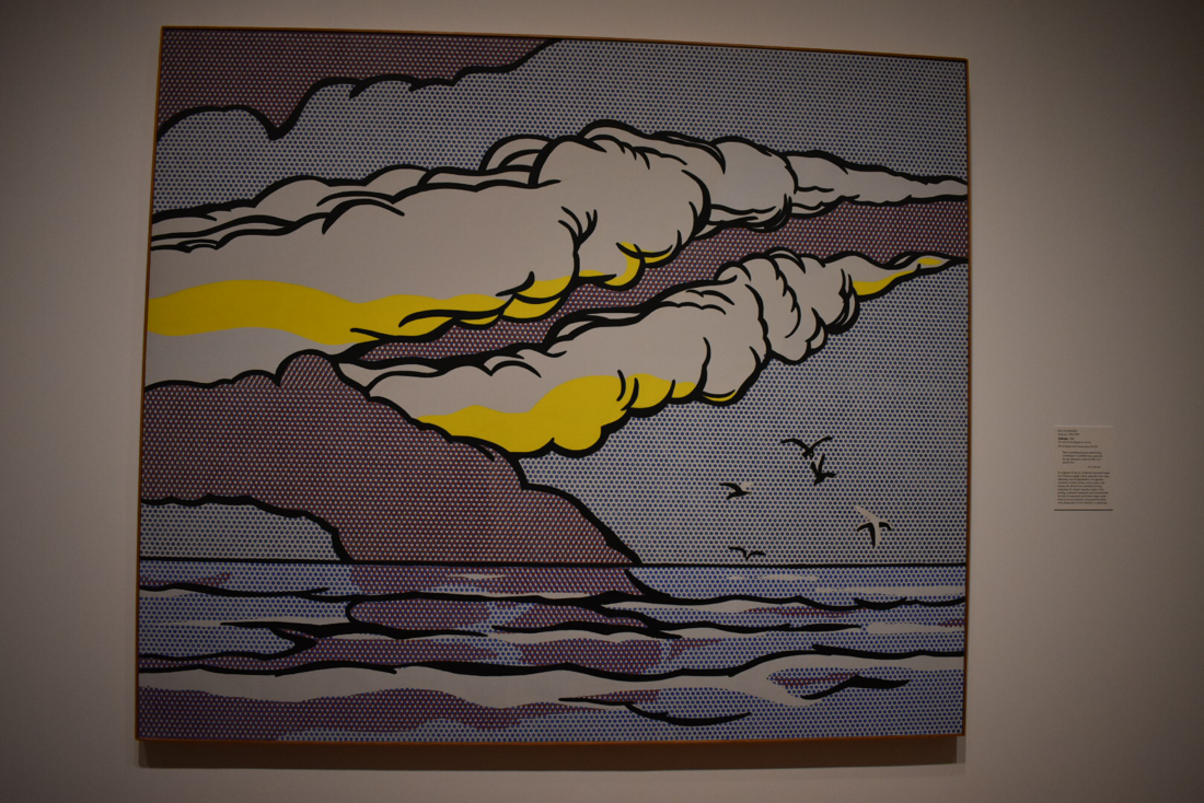
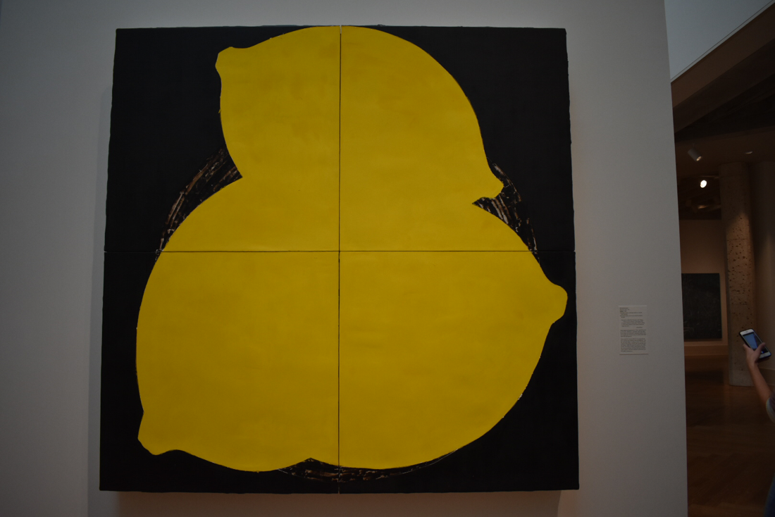
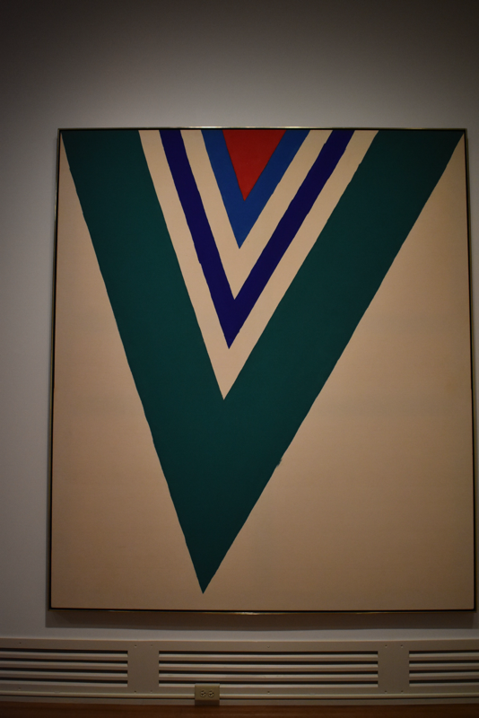
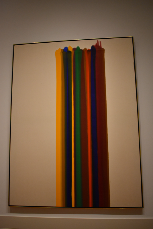
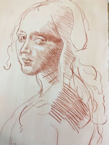
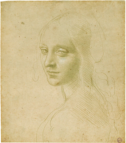
Howardena Pindell Exhibit The artist, Howardena Pindell, documented her life through memories as a sort of autobiography to show the viewer different aspects into her personality and what experiences makes her her. The main themes in her work were her personal experiences as an artist, a citizen, an activist, and a traveler, creating a memoir of her life. I enjoyed a majority of her work, only really veering away from the pieces that included vectors aka physics aka the bane of my academic existence. Her work as a whole was broken up into almost different styles with a cohesive series of dotted paintings in one area and then a very realistic painted collage series in another. I found this really interesting because I'm used to seeing a gallery with all of the same types of works or processes, and to see one about one artist but have completely different styles is unusual and very neat. Examples of this can be seen in the images below, however as I'm writing this, it occurs to me that they all have circles within them: the first is hole punches, the second is made up of tiny repeated dots, and the last is a circular shape (to clarify not all of the pieces in the exhibit follows this pattern, the ones that I chose just happen to do so). However, even though they all happen to have this common theme, they are all made using very different materials and processes to create works that you wouldn't necessarily be able to tell that they were all done by the same artist. to Abstraction and Mark Making Abstract v. Non Objective: Where do you draw the line? I personally draw the line if I can tell that the artist was trying to depict a form/object. Abstract is like a non-realistic (duh), non- accurate version of an object or scene. Non-objective is like the artist wasn't trying to depict anything in particular. In Alex Kate's Self Portrait with Sunglasses, he is portraying an image of himself wearing sunglasses (crazy, right?) , and while it is very abstracted and not realistic at all, you can still very clearly tell what it is depicting making it an example of abstract art. An example of non-objective art would be Howardena Pindell's Space Frame which shows a variety of colors, lines, and circular shapes because you can't really look at it and say "oh, she painted (insert object)", so for this reason I would categorize it as non-objective. Abstract Expressionism: What falls into this specific category? I think that art that falls under the category of abstract expressionism is art that emphasizes more of the process and materials to convey its meaning and express the artist's emotion. Typically the pieces that fall in this category also fall under non-objective work too, making it very difficult to distinguish if a piece belongs in one or the other or both. Franz Kline's untitled work is a prime example of abstract expressionism because he wasn't trying to depict anything in particular, and the art is more about the emotion in the thick black likes when contrasted against the stark white canvas. Mark-making: Can you identify the gesture/action/speed/process that was used to make the marks? In Jules Ohitski's Isis Ardor, you can tell that the piece was created with very deliberate marks and slow movements to create a very ~soothing~ vibe with his art. Also fun fact, this is probably one of my favorite pieces of art ever :) and my brother thinks it looks like a tide pod/logo. Born Again by Sam Gilliam looks like a very fast process with quick hand movements and flicks of paint or aluminium powder. Roy Lichtenstein's Gullscape looks like it took a lot of time and careful thought and precision to place each dot- unless he used a stencil. The thicker brush strokes look like they were made with a little more speed but a consistent motion/movement/speed. Use of art elements, design principles, and specific compositional choices: Can you tell what the artist was thinking, how they were planning, why they made such choices? How do these choices by the artist affect the viewer's experience? Lemons by Donald Sultun uses the elements of shape, color, and texture almost exclusively with the 2D shape and bright yellow of the lemons to create contrast and emphasis on them with the dark background and semi-realistic basket. It also has an asymmetrical balance with two larger lemons on the bottom and one smaller one on the top. 17th Stage was created by Kenneth Noland and uses line, shape, color: the thick real and implied lines using bold colors and creating the effect of triangles. These all create contrast (real v. implied), emphasis on the thicker bands of color, unity with a variety of widths and colors of the lines, and am asymmetrical balance. Morris Louis made Claustral with the elements of line and color, because it is literally lines of color on a canvas, along with the principles of contrast, emphasis, and balance. The colors all contrast with one another and with the blank canvas, there is much more of an emphasis on the colors than anywhere else, and there's an asymmetrical balance because the stripes are off center. 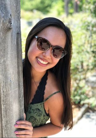 Hey so this is the image I'm thinking of doing my self portrait project on. Our focus is to use the same marks as the ones in our old master image and transfer that knowledge to an image of ourselves. The image is supposed to kind of represent who you are through pose and composition and I think that this pic does a good job of that because it is conveying a fun, carefree, and kind of goofy (huh, that's a weird word when you really look at it and sound it out) vibe which is kinda calming/soothing/zen and aspects of my personality that I really try to keep in mind if I'm stressed out or something. Also I really like that dress so that doesn't hurt :)
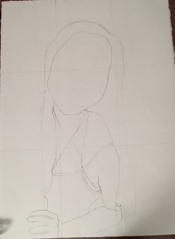
This is what my final drawing looks like when compared to the original. It probably would have helped if I had used the same material and I also am now realizing that I probably should have toned my paper more and a few things are slightly out of proportion/not in the right place. I did also take the pic at a weird angle so I'm hoping that when I take the pic at a more direct angle it will look slightly better?? But overall I'm fairly happy with the result and while there are some things here and there that I would like to change, I think that I grew as an artist and definitely learned a lot about mark-making and certain techniques (such as to make sure hatching lines are parallel and the importance of line quality!!) that I'm excited to bring into my next drawing!
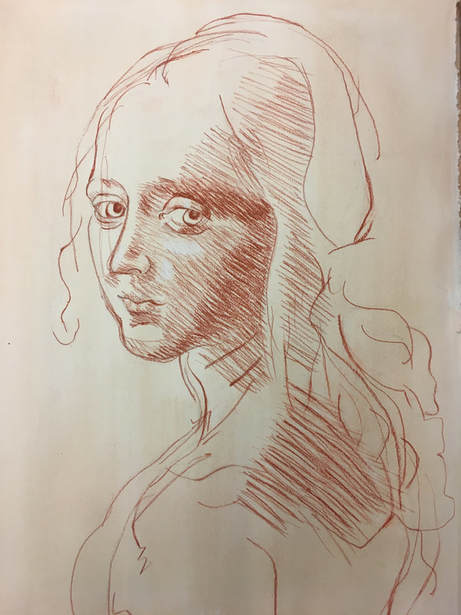 I've finished most of the marks today but I am now realizing that some of my lines are not quite accurate creating some ~strange~ forms. Also I tried to fix some of the lines on her back but after I erased the original ones and drew more on, it just kinda a looked sloppy and muddled.
|
AuthorNatalie Kim is a senior at MLWGS who likes to do art, take pics, and pet puppers. Archives
May 2020
Categories
|
 RSS Feed
