|
bio
art
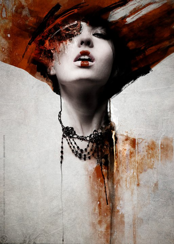
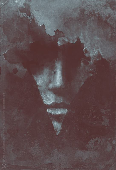
What initially attracted me to Jarek Kubicki was that he deals with both photography and digital art, two fields that I would like to delve into further. However, after researching him, I found that he also works as a creative director for an advertising agency and because I want to go into marketing as a career, it blew my mind that he was doing both at once. I really like the surreal-ness of his work and it has inspired me to try and blend my digital works with my physical. sites
This is his official art website if you would like to check out what he does! www.kubicki.info/ This is his facebook page where you can view more of his art: www.facebook.com/pg/jarek.khaal.kubicki/photos/?tab=album&album_id=181310391888330
1 Comment
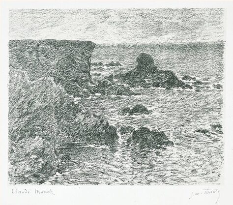 This is the piece done by Monet that kinda inspired this lil adventure. It's cool how you can see the same strokes he used when painting in this drawing (more impressionistic and dashy) and is still able to depict a fairly realistic scene. 11/13/19- I got a lot of complements in class today on how I portrayed the water/waves as well as my mark-making for the boomerang-shaped rock formation. I did have some critique that I needed a bit more value so I added more to a couple of the rocks to give them more depth. Overall I am fairly pleased with how it turned out- the water turned out looking rather organic and free so I was happy with that but many of my proportions are off and some of the rocks look like they are at a different angle when compared with others.
11/12/19- So I'm done for the night. I tried my best with the water but some areas are definitely not quite the same value wise. I'm also not super happy with the proportions of some of the formations because it makes the overall composition more condensed. However, it could, theoretically, be much worse. :) 11/10/19- Ha so it's been a sec since I've last worked on this but I have made progress. I am realizing that I really messed up my perspective somewhere along the way as it looks like I'm looking down on instead of looking across the cliffs. I also messed up on the proportions as some parts of the cliffs are larger and others are smaller but it's a bit late for me to try and fix all of that so it's just going to have to exist. I am overall not mad with how it's turning out but I think I could have planned out the general shapes a bit better so that the overall product had a more accurate result. I also found that my drawing "style" aka drawing with super thick and heavy lines, especially when I mess up, is actually rather advantageous for this particular piece as the shadows of the cliffs require thicker lines to give the impression of depth. I may have procrastinated finishing this piece a little so I'm only about halfway done and it's due in t-minus two days- wish me (and my sleep schedule) luck!! 10/22/19- I like where I am right now. I am able to give the appearance of detail without having to get too too deep into accuracy because after staring at the same clump of rocks for hours, it all kinda starts to look the same. So it isn't going to be exact to the image, but I'm hoping to get some realism out of it. For the critique today in class, Mia suggested using a piece of wood or something to have at an angle above the paper so I can rest my hand without smudging things. I am worried in general with the time line because I think I'm a bit behind but hopefully I can get some work done this week. 10/10/19- I realized that some of my proportions/general arrangement of stuff was inaccurate so I tried to change it and I think it is better? I'm getting a little frustrated with the paper because it is a little too smooth and anytime I touch it, the charcoal lifts from the paper which makes this a tedious process. Overall though, I am happy with how it is turning out. 10/6/19- This marks the start of the first home project of the year! So I am choosing to draw this seascape/landscape in charcoal on a larger than average piece of paper. I actually thought I would originally do this in pen and ink but I was looking online for examples of landscapes and I found a seascape of some cliffs over water done by Monet. This was actually done in charcoal and I liked how the water was done so I'm going to try and use the same material although I doubt mine will be as successful as his. I also made a kinda big mistake where I forgot to mathematically scale the paper up before cutting it so things are automatically not going to be perfect but I'm going to roll with it and hopefully end up with a product close to the actual proportions. Looking at the pic and my first "draft" side by side I'm realizing that there is a lot that I need to change so my plan is to rearrange the stuff next time and then move on from there. |
AuthorNatalie Kim is a senior at MLWGS who likes to do art, take pics, and pet puppers. Archives
May 2020
Categories
|
 RSS Feed
