|
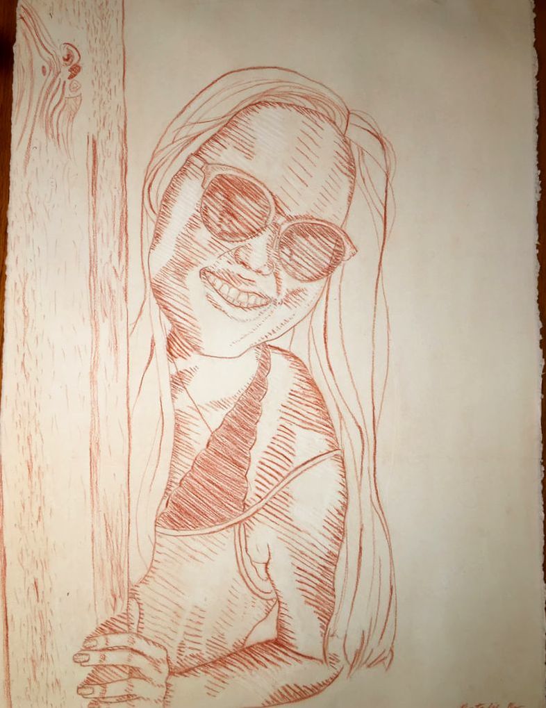
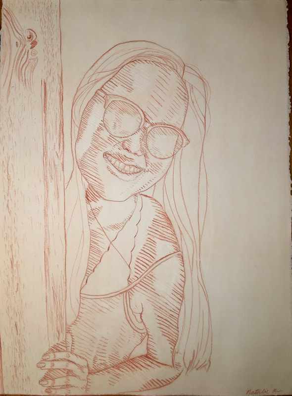
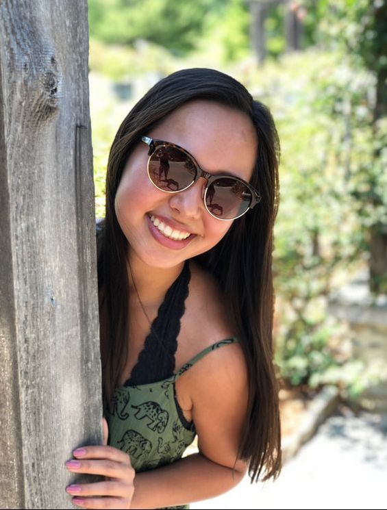
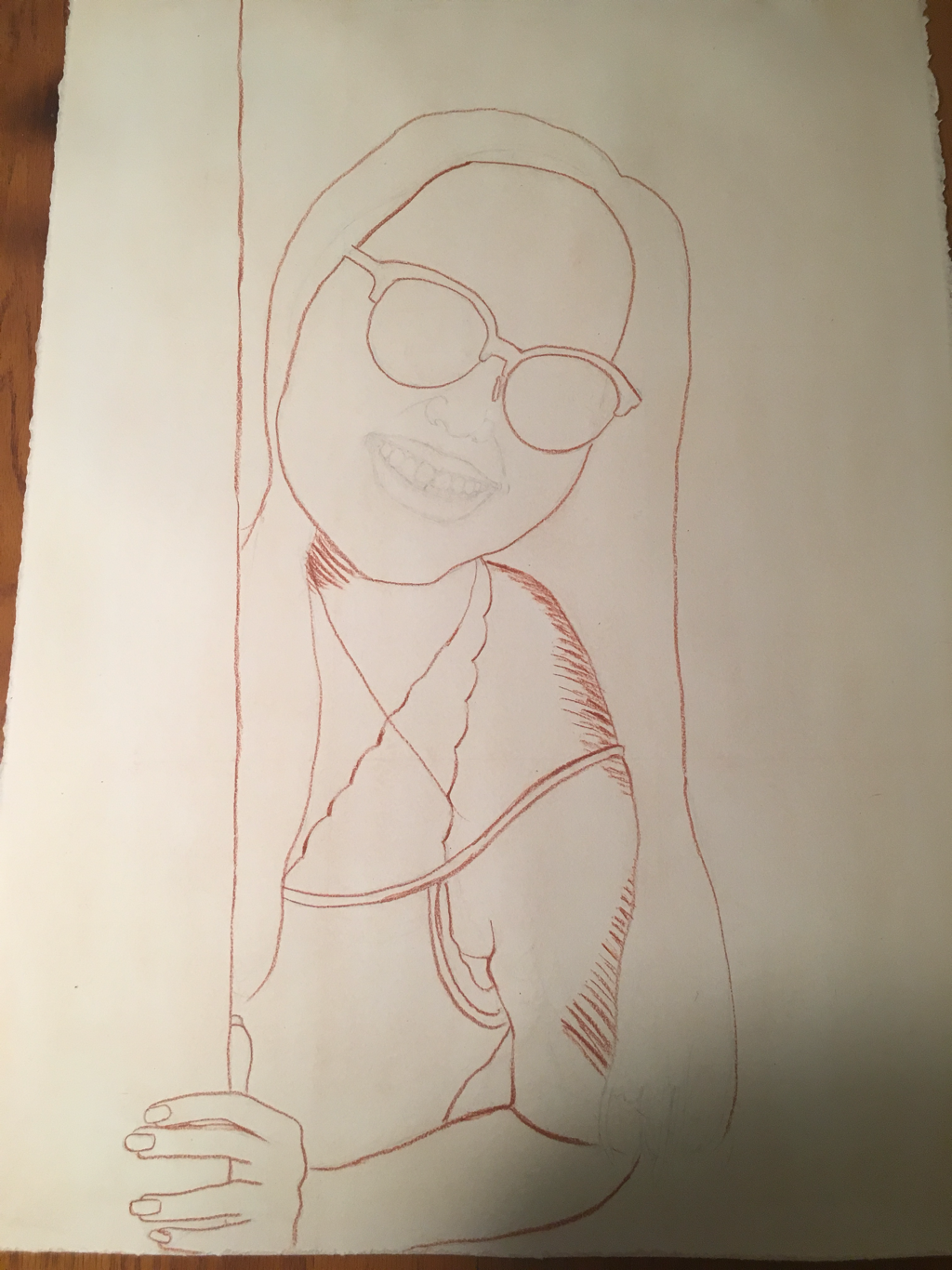
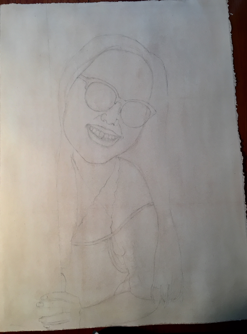
So I thought the last post would be my last and so that one really has a majority of my closing thoughts. With the advice of Mrs. Mosley, I went back in and added conté/shading/hatching/value to the sunglasses and bralette (although I'm just now realizing I forgot a tiny bit on the side but I'll fix that in class as it won't take too long and hopefully it will be good for my gallery post).
0 Comments
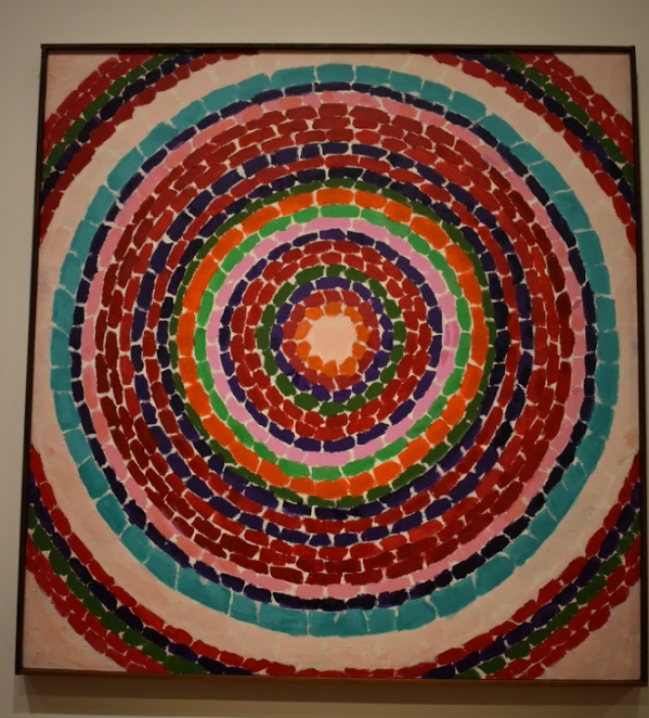
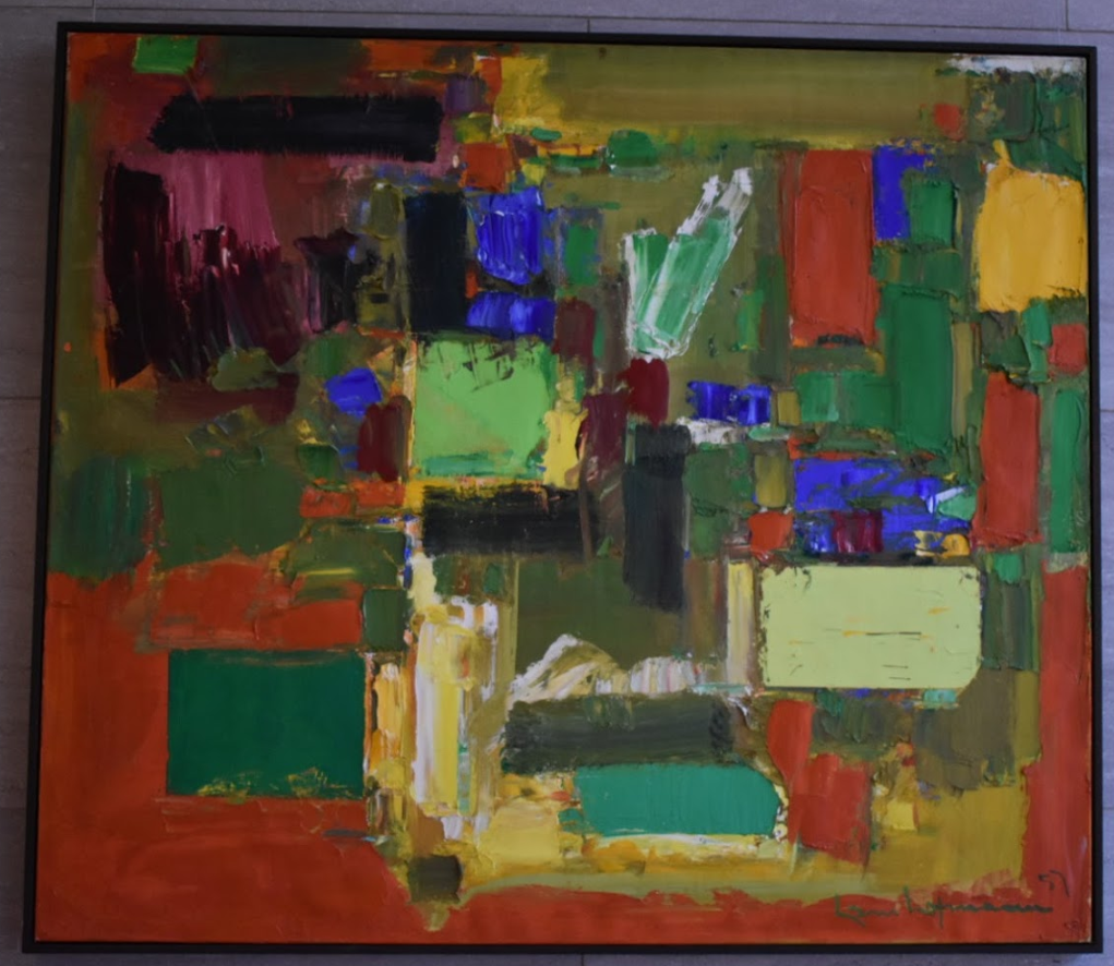
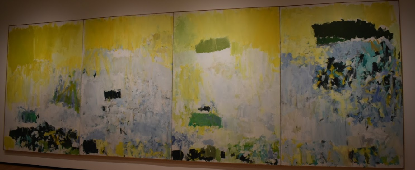
Abstract Expressionism All three of these pieces mainly utilize blocks of color but I kinda unintentionally ordered them from more "organized" brushstrokes to more all over the place (like my room rn) with the processes/ speed of the artists' movements seemingly speeding up with slower and more careful strokes on the left and faster and less precise strokes on the right. The first piece, Pansies in Washington by Alma Thomas, looks as if it was made by layering thick brushstrokes of paint on a blank canvas with a general sense of precision and accuracy. I was a little surprised to find that this piece/artist is considered abstract expressionistic because it's so neat and orderly and when I think of abstract expressionism, I typically think of pieces like the one on the far right with many fast movements and no specific pattern. But I actually really like how the colors look next to each other (color theory/simultaneous color contrast) and it's just really satisfying to look at (which isn't how I would normally describe art lol). The second piece by Hans Hoffman titled Autumn Gold, I liked because it has solid blocks of color and the texture is SO COOL!! I'm surious as to how he was able to create perfectly straight lines for some of the blocks and also have less neat edges on others because I feel that a lot of the time (and with what limited art knowledge I have), artists typically use one or the other (straight or messy) and don't necessarily combine the two. The third piece titled Salut Tom by Joan Mitchell is like the most abstract expressionist painting that one can think of ( if you aren't thinking like drip paint aka Pollock). It appealed to me because I particularly enjoy how he has places with small groups of concentrated brushstrokes and colors and balances it with the larger expanses of canvas with one color that blends into others. Inspiration for Play
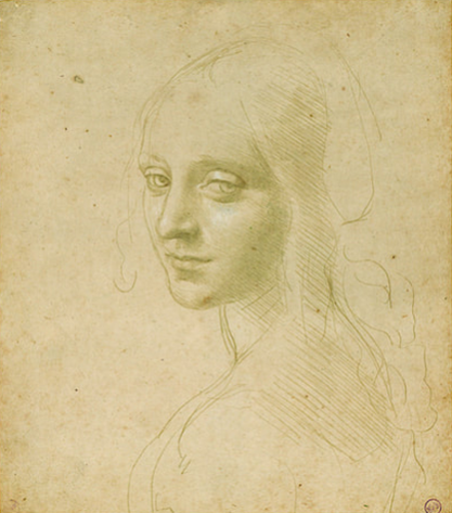
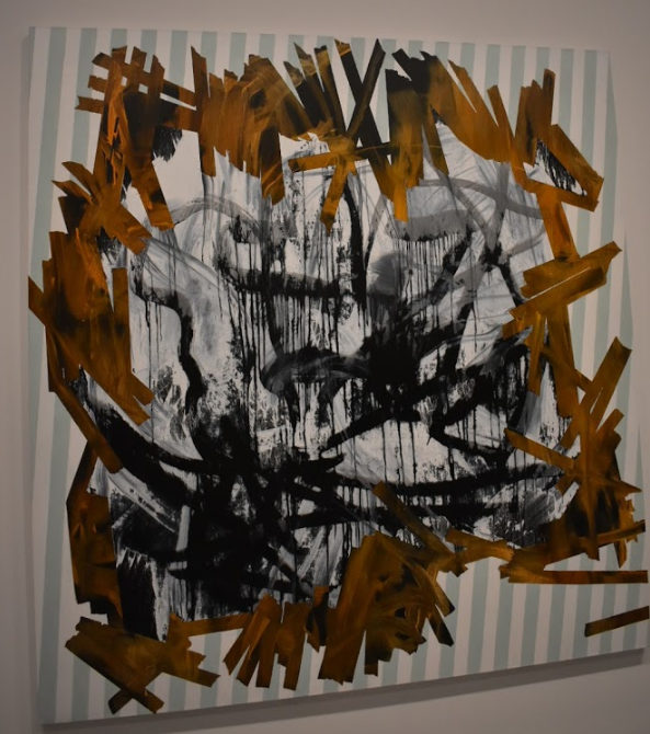
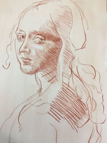
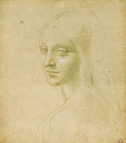
The first work by Charlie von Heyl is titled Painting and I just thought it was really neat how she juxtaposed the different syles of crisp clean lines, to a blending of three-ish (?) colors, to singular brushstrokes of black on white. I also found the technique she used of painting a layer, taping it, (I'm assuming) painting over it, and peeling up the tape (?) to reveal the previous layer. I kinda did a similar thing when I was younger but on a much simpler scale and it's also used as a nail art technique which (if you didn't know, I'm very into) so I thought it was interesting to see that translated into a larger and more elaborate piece of work. The next two works (Landline Blue Black by Sean Scully and Red Dance by Kenneth Young) are very similar and yet completely different from each other, but both appeal greatly to me. Landline Blue Black appealed to me because the style it was done in is very tranquil and the color definitely helps to convey that feeling. Red Dance is very different and conveys more of a dynamic emotional response due to the warmer colors and how sporadically the dots ere placed and how they spread. I just love how in both, the medium spread and blended with the other colors in the works and ahh its just really nice to look at. This is something that I want to experiment more with for my play pages because I do a lot with watercolor and ink right now and I enjoy seeing the ink spread and mix with the watercolor so I would like to see how that would go if I began to do that with the watercolors themselves. Ta daa !! My final drawing next to the image I was attempting to replicate with the original old master drawing this whole thing was based off of and my replica of said drawing lol. Reflectively, I feel a lot more confident with spotting value/ putting it on paper even though I'm still not stellar at it. I'm not sure if I should go in and add some value to the bralette part (I prob should) but I can't see any because it was originally black ? and I don't just want to guess where the value should go. Overall, I'm fairly content with how it turned out, but am seeing things in the face especially that I want to go back and fix- depending on time and stuff I might- but yeah a far as drawings go I'm pretty pleased :)
|
AuthorNatalie Kim is a senior at MLWGS who likes to do art, take pics, and pet puppers. Archives
May 2020
Categories
|


 RSS Feed
