|
Today was this year's first Lunchtime Lecture! We heard from the perspectives of six students who already graduated from Maggie Walker, and some even from college, and who are majoring in art or the general art field. We had one student from MICA, four from VCU Arts, and one from UVA Architecture and I found it really interesting to hear their take on the experiences they've had. I found it funny how while some people went directly into art, others kinda wandered their way into the field such as Bailey, who had intended on pursuing politics, and Alex, who originally went to two community colleges before deciding to go to art school.
A common lesson that I heard that could be applied to not just the art world was that something that they all found most annoying was complaining from other people that was referred to at one point as "studio culture". Unfortunately, I think I would fall into this category of people as I have a tendency to express discontent with assignments and grades among other things. They stressed the importance of being grateful for what you have available to you as well as working hard instead of sitting back and making excuses for why something didn't turn out and I liked that attitude and approach to being faced with less-than-ideal circumstances. For example, instead of complaining about a grade a teacher gave you, avenging yourself by doing super well on the next assignment. Something else that stood out was that art stretched and challenged them in different ways and how that may have shifted their views on art in general. They shared frustrations with prompts as well as with classes and peers and how that has impacted their art and what they are able to make. I found it disappointing how about half of them mentioned that they felt restricted in such an institutionalized setting and I think that while the purpose of the school is to push you and force you to interact with thinks and people you might not normally, it shouldn't put you in a situation where you are so frustrated that you are no longer excited by art, as seems to be the case with Eli, who talked about how he was upset with the structure of the classes available. I was most interested by Bailey's experience at UVA Architecture for a few reasons: 1) I will be attending UVA next year, 2) my best friend is also going and will be doing UVA Architecture, and 3) he talked about how he like the creative outlet but how there were rules and guidelines that he had to cater towards. This appealed to me because the concept of art is so expansive that it can cover anything from a banana duct taped to a wall, to a massive monument installation that uses the history of the city in order to contribute to it's content and it seems almost overwhelming when being let loose to make and define whatever you want as art. I like the idea of having a form of creative expression but also having some foundation or footing of which to go off. I might consider this when going in the general direction of business. I had been thinking about being an advertising and marketing manager for a while but I think I would maybe want to be on the more analytical side? Actually, I'm not sure I kinda have a negative disposition towards math so not sure that would work out very well but I guess I would have to see the options available when studying at UVA and see the job market and pay as well as if I would enjoy doing it. Overall, I really liked this lecture as it gave different experiences from people who all essentially began in the same program I am currently in and it is just interesting to see where everyone ends up in life. Here are a couple links to art sites of a couple of the students who talked to us today: https://scaparo.weebly.com/ www.instagram.com/its_prettybent/
0 Comments
So today we went on a walking field trip to the ICA and the task was to find a piece of art that we liked and then to write a list of ten words that described the process that we think they used to make their art. I stumbled upon a work by artist Paul Mpagi Sepaya and was intrigued by the blurred parts of the image. Most photographers want to depict forms clearly or, at the very least, in focus and so to find multiple images where forms were intentionally blurred and shadowed was something I found to be unique. His content as I interpreted it was about how people, of light and dark skin as well as straight and queer sexual orientation, are all essentially the same and shouldn't be typified into race, gender, etc. I really like how he created something so mysterious and hazy with an art form that is usually focused on depicting a form "perfectly" and I want to try and experiment with this style a bit. 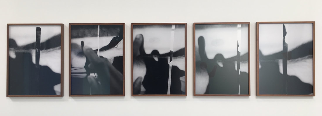  Here are a few links if you would like to learn more about his art!
https://www.artsy.net/artist/paul-mpagi-sepuya https://www.paulsepuya.com/ www.guggenheim.org/artwork/artist/paul-mpagi-sepuya Today, I went on a First Friday art walk around Richmond, VA where I walked to various galleries with a group of friends to discover lesser known artists in the area. I particularly enjoyed seeing work by an artist named Todd Hale as we had actually seen his work at a gallery last year and it was neat to compare how aspects of his work has changed and stayed the same since. Hale's works in the past and present both use color extensively, mainly in bright, highly saturated tones however this time, he seemed to focus on more digital processes. Based on his descriptions and what I could see, he used the movie Alice and Wonderland and altered parts of the film to look unrecognizable. Then it looked like he printed them out and manually cut out and rearranged them on a canvas before pouring epoxy over the piece. I was particularly drawn to these pieces as I am interested in working in a mixture of digital and physical works and it was neat to see a way that both were combined in a single work. I also looked him up and found that he also does photography, another art form in which I am interested. This was a rather neat discovery because he seems be interested in many of the same things I am and while his work is a bit more chaotic ? than I would describe mine, it is neat to see how we both use the same/similar mediums but in different ways. His work has given me more ideas on how I can experiment with mine so I am particularly excited for the upcoming quarter!
 Let me begin by saying that I really enjoyed this lunchtime lecture. I found the concept of conceptual art (haha) to be so interesting because the artist, John Freyer, wasn't really making a physical art piece, although I guess the bike and water jars technically count, but the art was created by the connections people made with other people. I really liked the idea of how his art was serving the community, locally and globally, and kind of raising awareness about addiction and recovery. The Free Hot Coffee Cart itself was also created with a lot of help from the art community at VCU so I found it fascinating that the community was helping the community, creating a little network and cycle that gradually grew as the cart and it's message grew. I thought that Freyer was a very interesting individual as I would definitely not be able to do his "All My Life for Sale" unless I had a secret double life that had everything I actually cared about. I appreciated how open he was about sharing about his addiction and sobriety journey as that really showed the root of his content and why he was doing what he was doing. I found that the advocacy and political aspect of his work was very intriguing because he was trying to more directly create change in our society by setting up the cart outside of legislative sessions to bring more attention to the message he was trying to spread. I consider myself a people-person and so it was really eye opening to see a form of art that was really all about the people involved and their interactions with the artist and the other participants. I think that this movement of art is something that I will want to look into a little more and maybe experiment with? Although this would be hard because it seems like you need to have some financial support to do a lot of what Freyer did but there are other more affordable avenues that should be explored and investigated.
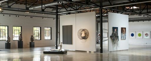
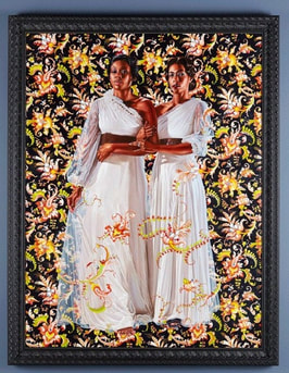
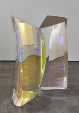
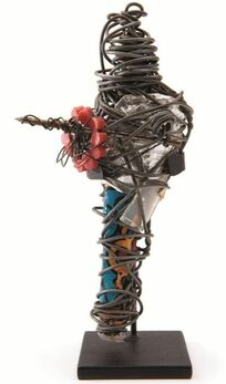
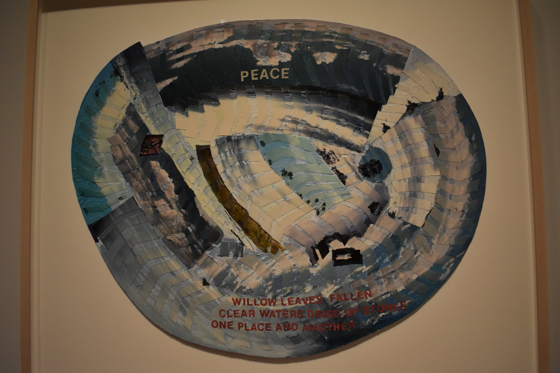
I honestly inspire to be the these people: to be rich enough to have enough art for my own personal art gallery of only the things that I like. I was wowed by the art included in the collection and absolutely loved the backstory behind the name of the gallery, based on the building's history as a bottling facility for Try-Me Soda. I was also very appreciative that the collectors, Pam and Bill Royall, were more interested in contemporary art and were interested in art that was empowering minorities and women, an agenda which I wholeheartedly support. Right when we walked in, I was ecstatic to see multiple pieces by Kehinde Wiley, an artist which I have come to appreciate more and more for his content and style. After being instantly captured by the vivid colors and patterns of his work, I was able to actually look around the area, glimpsing the work of Mariko Mori shown in the middle picture. In the light of the store, they were almost glowing and the reflections, or should I say refraction, of light shifted as you moved around the piece, giving the very heavy, very large blacks of acrylic a lightness and fluidity. Towards the end of the tour, we learned about the Philadelphia Wireman and his work, which I found incredibly interesting. I could almost picture this mystery man fiddling with wire and random objects in a corner of the abandoned building and making these pieces, a rather sad image as the world would never discover who he was. Anyway, his art really inspired me and I love how compact the little sculptures are but how complex they are too. They may not have had any intended content to the person making them, only to keep their hands and mind busy, but they have made a significant impact in the art world. I really love how they aren't particularly beautiful or aesthetic, but the sculptures have their own little style and funk that make them so intriguing to the viewer. I really had a great experience at the Try-Me Gallery because of how all of the pieces all seemed to have a flow from one to the other, creating an energy within the gallery that only made the art more interesting. I loved the art that had been collected because I find the more contemporary and slightly more unusual works more interesting than the tediously painted or drawn ones done by more traditional painters because these seem to be like mental puzzles to be unlocked. I really hope to return to the gallery to have a little more time to look at the pieces and learn more about the artists but this trip was a really fun peak into the collection.
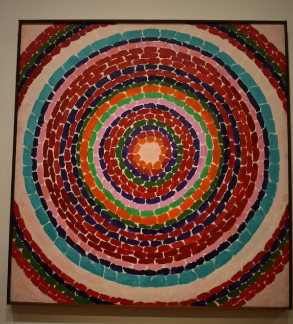
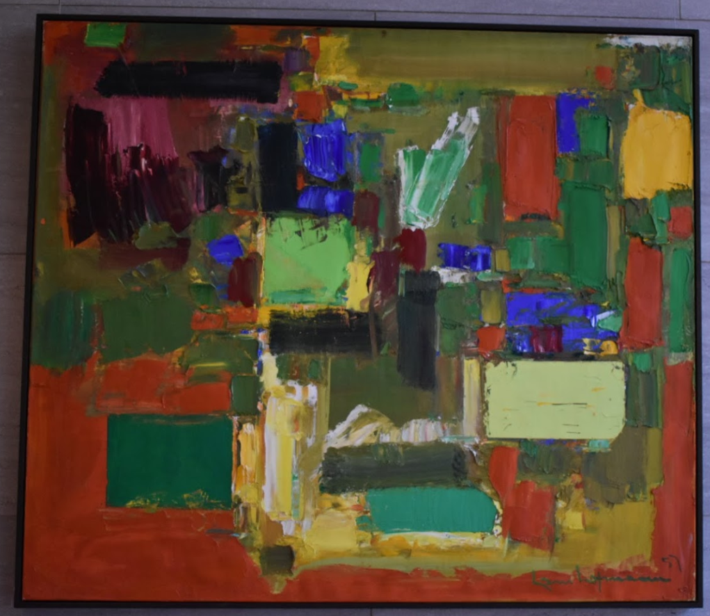
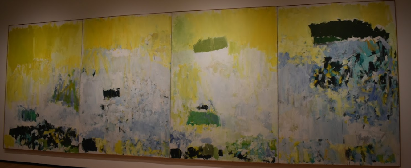
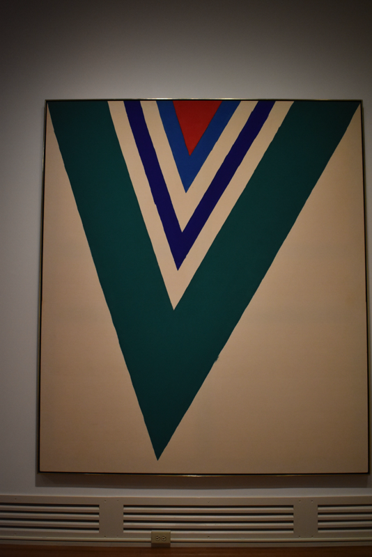
 Sasha Waters Freyer described herself as a "video experimental feminist", a title which I think is pretty cool. She seems kinda like a superhero as by day, she is a professor at VCU arts for photography and film, but by night/day when she isn't teaching, she creates films by "optically reprinting" by mixing "old and new footage for lyrical exploration". I can sort of relate myself to her because she mentioned that she wanted to go into a career in both art and the marketplace, which is a happy medium that I am currently trying to find in a career. Freyer studied photography at the School of Visual Arts in New York where she earned a Bachelor in Fine Arts when she began to shift her focus away from photography and more into documentary film. After her interest in film grew, she began to work in experimental film which dials in on the medium of the film specifically just like how paint and clay are considered mediums of art. She views this as more of the poetry of film versus a story where the color and form accumulate to create a more personal and individual meaning. She recently created a film titled Winogrand: All Things are Photographable after the famous street photographer who was viewed as controversial during his time and is considered the first digital photographer as he shot images without considering "the economy of film". This film was picked up by American Masters, an Emmy award winning show, which will be broadcasted on PBS on April 19th. This just shows how if you truly are passionate about something, you can become successful and enjoy what you are doing. I came away from this lecture with a new outlook on art and life in general where Freyer really stressed the importance of studying what you are passionate about and how art can teach you a variety of skills that you wouldn't have otherwise learned. She also is a true example of how hard work and a passion for what you do, combined with having experience and actually being good at it of course, can lead you to a successful path in life. I really am in awe at her story and her work, where I can find some parallels to what she does with film and with what I do with my digital editing which is neat, because she is able to do it all, being a wife and mother, a teacher, and a filmmaker, and not only that, but she is able to do it all well. It seems extraordinary that she can find time to do everything she loves along with her job and chores and still win awards and gain fame and notoriety for her work. Here is a link to her website where you can view her work: www.pieshake.com/ Here is video of the official trailer of Winogrand: All Things are Photographable: Abstract Expressionism All three of these pieces mainly utilize blocks of color but I kinda unintentionally ordered them from more "organized" brushstrokes to more all over the place (like my room rn) with the processes/ speed of the artists' movements seemingly speeding up with slower and more careful strokes on the left and faster and less precise strokes on the right. The first piece, Pansies in Washington by Alma Thomas, looks as if it was made by layering thick brushstrokes of paint on a blank canvas with a general sense of precision and accuracy. I was a little surprised to find that this piece/artist is considered abstract expressionistic because it's so neat and orderly and when I think of abstract expressionism, I typically think of pieces like the one on the far right with many fast movements and no specific pattern. But I actually really like how the colors look next to each other (color theory/simultaneous color contrast) and it's just really satisfying to look at (which isn't how I would normally describe art lol). The second piece by Hans Hoffman titled Autumn Gold, I liked because it has solid blocks of color and the texture is SO COOL!! I'm surious as to how he was able to create perfectly straight lines for some of the blocks and also have less neat edges on others because I feel that a lot of the time (and with what limited art knowledge I have), artists typically use one or the other (straight or messy) and don't necessarily combine the two. The third piece titled Salut Tom by Joan Mitchell is like the most abstract expressionist painting that one can think of ( if you aren't thinking like drip paint aka Pollock). It appealed to me because I particularly enjoy how he has places with small groups of concentrated brushstrokes and colors and balances it with the larger expanses of canvas with one color that blends into others. Inspiration for Play
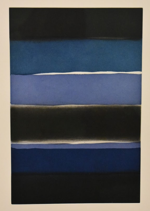
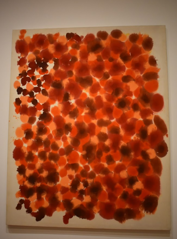
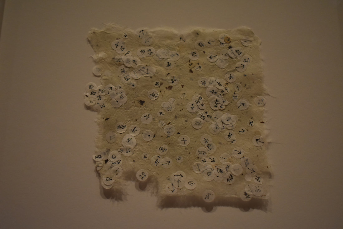
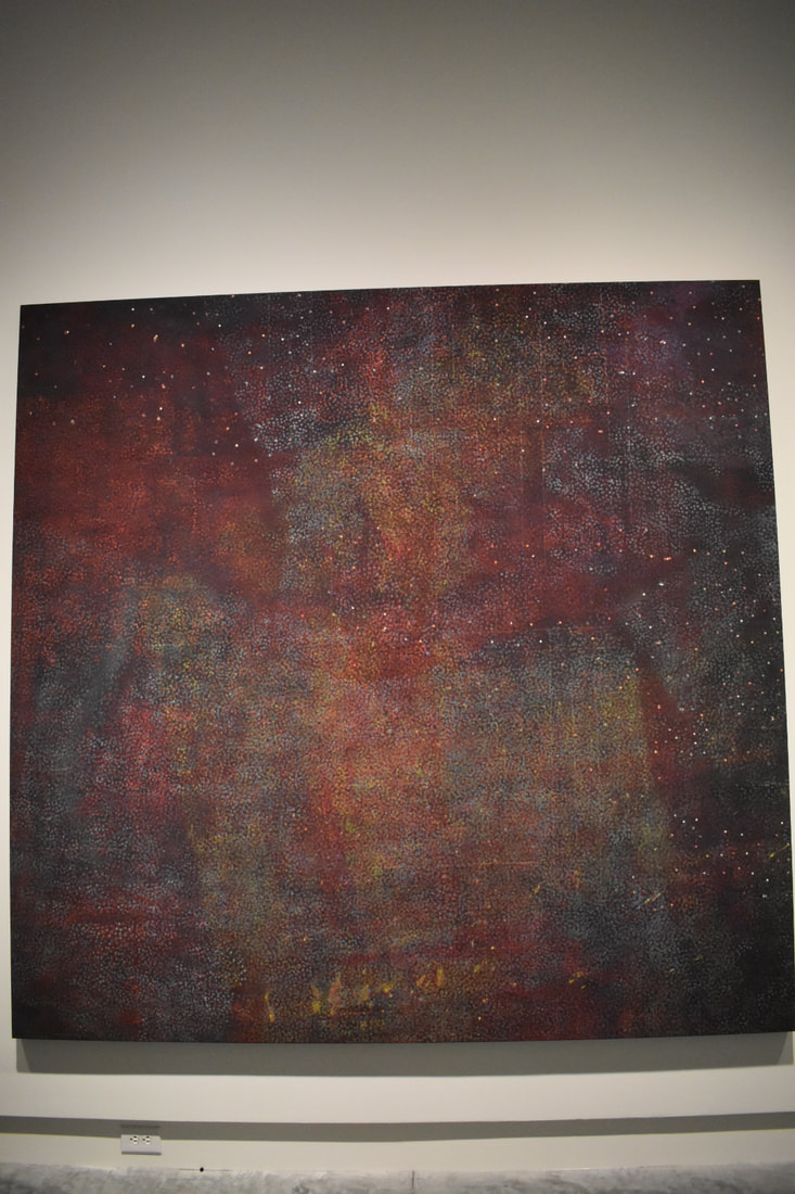
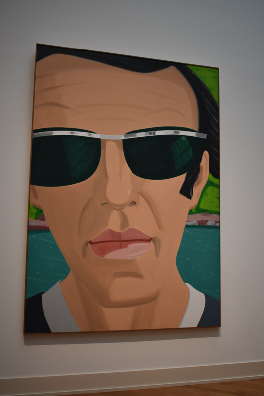
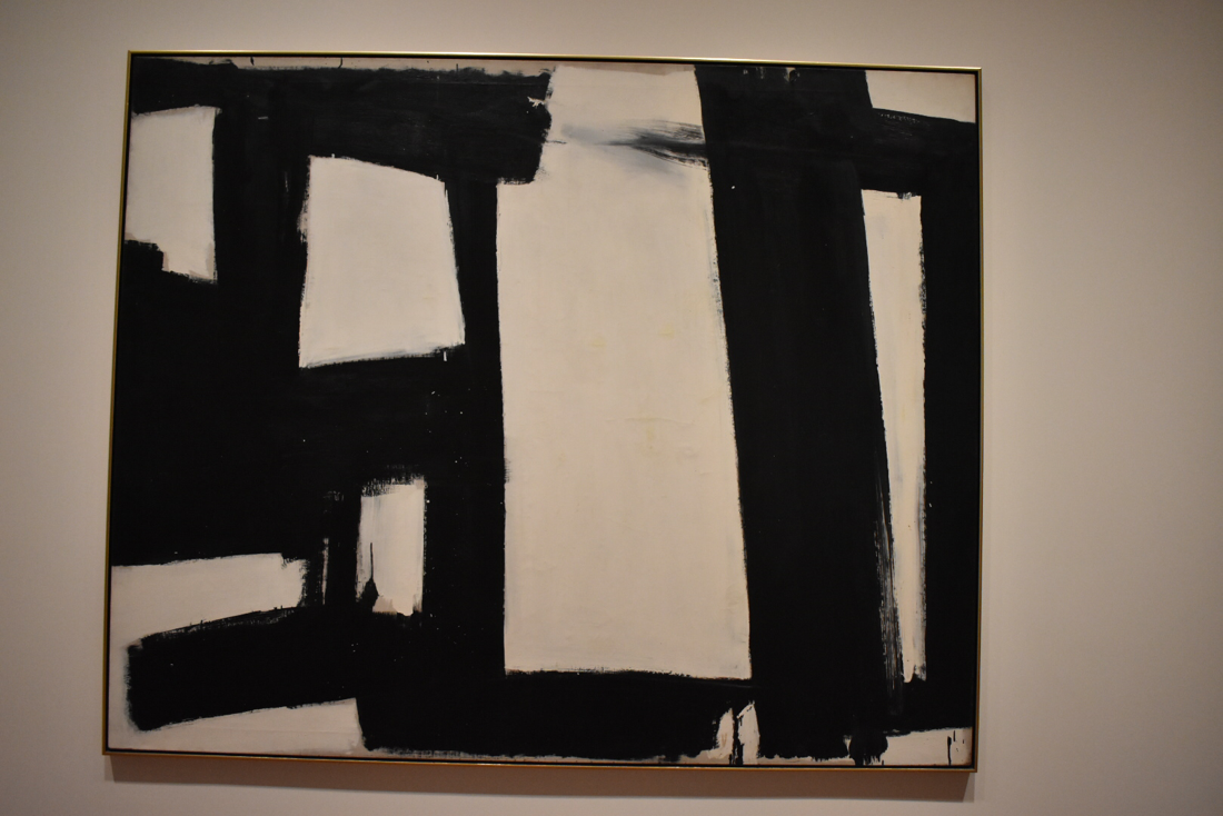
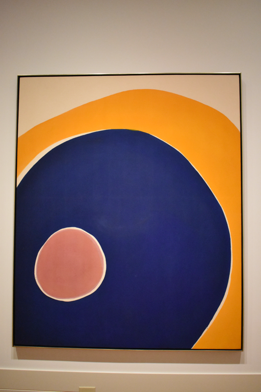
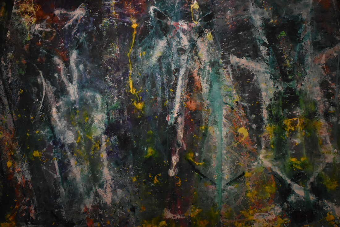
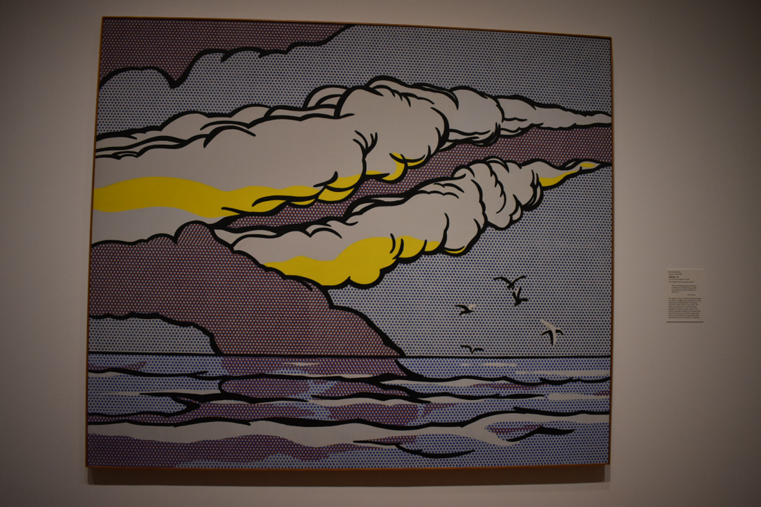
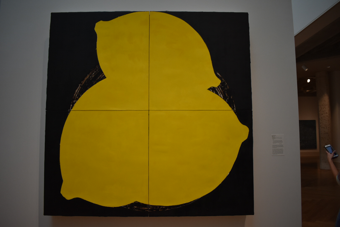
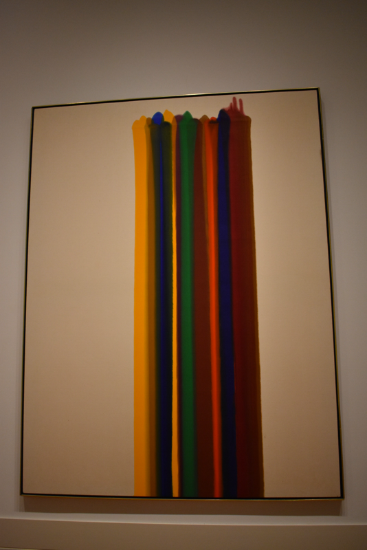
The first work by Charlie von Heyl is titled Painting and I just thought it was really neat how she juxtaposed the different syles of crisp clean lines, to a blending of three-ish (?) colors, to singular brushstrokes of black on white. I also found the technique she used of painting a layer, taping it, (I'm assuming) painting over it, and peeling up the tape (?) to reveal the previous layer. I kinda did a similar thing when I was younger but on a much simpler scale and it's also used as a nail art technique which (if you didn't know, I'm very into) so I thought it was interesting to see that translated into a larger and more elaborate piece of work. The next two works (Landline Blue Black by Sean Scully and Red Dance by Kenneth Young) are very similar and yet completely different from each other, but both appeal greatly to me. Landline Blue Black appealed to me because the style it was done in is very tranquil and the color definitely helps to convey that feeling. Red Dance is very different and conveys more of a dynamic emotional response due to the warmer colors and how sporadically the dots ere placed and how they spread. I just love how in both, the medium spread and blended with the other colors in the works and ahh its just really nice to look at. This is something that I want to experiment more with for my play pages because I do a lot with watercolor and ink right now and I enjoy seeing the ink spread and mix with the watercolor so I would like to see how that would go if I began to do that with the watercolors themselves. Howardena Pindell Exhibit The artist, Howardena Pindell, documented her life through memories as a sort of autobiography to show the viewer different aspects into her personality and what experiences makes her her. The main themes in her work were her personal experiences as an artist, a citizen, an activist, and a traveler, creating a memoir of her life. I enjoyed a majority of her work, only really veering away from the pieces that included vectors aka physics aka the bane of my academic existence. Her work as a whole was broken up into almost different styles with a cohesive series of dotted paintings in one area and then a very realistic painted collage series in another. I found this really interesting because I'm used to seeing a gallery with all of the same types of works or processes, and to see one about one artist but have completely different styles is unusual and very neat. Examples of this can be seen in the images below, however as I'm writing this, it occurs to me that they all have circles within them: the first is hole punches, the second is made up of tiny repeated dots, and the last is a circular shape (to clarify not all of the pieces in the exhibit follows this pattern, the ones that I chose just happen to do so). However, even though they all happen to have this common theme, they are all made using very different materials and processes to create works that you wouldn't necessarily be able to tell that they were all done by the same artist. to Abstraction and Mark Making Abstract v. Non Objective: Where do you draw the line? I personally draw the line if I can tell that the artist was trying to depict a form/object. Abstract is like a non-realistic (duh), non- accurate version of an object or scene. Non-objective is like the artist wasn't trying to depict anything in particular. In Alex Kate's Self Portrait with Sunglasses, he is portraying an image of himself wearing sunglasses (crazy, right?) , and while it is very abstracted and not realistic at all, you can still very clearly tell what it is depicting making it an example of abstract art. An example of non-objective art would be Howardena Pindell's Space Frame which shows a variety of colors, lines, and circular shapes because you can't really look at it and say "oh, she painted (insert object)", so for this reason I would categorize it as non-objective. Abstract Expressionism: What falls into this specific category? I think that art that falls under the category of abstract expressionism is art that emphasizes more of the process and materials to convey its meaning and express the artist's emotion. Typically the pieces that fall in this category also fall under non-objective work too, making it very difficult to distinguish if a piece belongs in one or the other or both. Franz Kline's untitled work is a prime example of abstract expressionism because he wasn't trying to depict anything in particular, and the art is more about the emotion in the thick black likes when contrasted against the stark white canvas. Mark-making: Can you identify the gesture/action/speed/process that was used to make the marks? In Jules Ohitski's Isis Ardor, you can tell that the piece was created with very deliberate marks and slow movements to create a very ~soothing~ vibe with his art. Also fun fact, this is probably one of my favorite pieces of art ever :) and my brother thinks it looks like a tide pod/logo. Born Again by Sam Gilliam looks like a very fast process with quick hand movements and flicks of paint or aluminium powder. Roy Lichtenstein's Gullscape looks like it took a lot of time and careful thought and precision to place each dot- unless he used a stencil. The thicker brush strokes look like they were made with a little more speed but a consistent motion/movement/speed. Use of art elements, design principles, and specific compositional choices: Can you tell what the artist was thinking, how they were planning, why they made such choices? How do these choices by the artist affect the viewer's experience? Lemons by Donald Sultun uses the elements of shape, color, and texture almost exclusively with the 2D shape and bright yellow of the lemons to create contrast and emphasis on them with the dark background and semi-realistic basket. It also has an asymmetrical balance with two larger lemons on the bottom and one smaller one on the top. 17th Stage was created by Kenneth Noland and uses line, shape, color: the thick real and implied lines using bold colors and creating the effect of triangles. These all create contrast (real v. implied), emphasis on the thicker bands of color, unity with a variety of widths and colors of the lines, and am asymmetrical balance. Morris Louis made Claustral with the elements of line and color, because it is literally lines of color on a canvas, along with the principles of contrast, emphasis, and balance. The colors all contrast with one another and with the blank canvas, there is much more of an emphasis on the colors than anywhere else, and there's an asymmetrical balance because the stripes are off center. 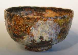 raku pottery in the style of wabi sabi raku pottery in the style of wabi sabi Hey so this is a reflection on a Lunchtime Lecture given by Amanda Adams, curator at the VMFA, about the traditional aesthetics and styles of art the Japanese culture values. She spoke about how the culture of countries in the east and west changed greatly after being impacted by the "agreement" reached between Commodore Mathew Perry and Japan that made Japan finally open its doors and spread its culture and products to the rest of the world. I really enjoyed learning more about wabi sabi and yugen as well as the ideas of Tanizaki. I already knew a little about wabi sabi, which is about recognizing the beauty in the ordinary and a melancholy feeling or sensitivity to things, but the concept of yugen, which represents mystery and a sense of lingering emotion, was completely new to me and something I found to be very intriguing. Tanizaki was a Japanese author who wrote a book called In Praise of Shadows mourning the Japan of the past that valued all of these concepts before becoming more westernized and changing their traditional ideals of beauty. I think that it's important to always keep in mind the importance of recognizing imperfections and instead of trying to get rid of them, embracing them to the point that they are considered beauty in almost a purer form. I want to try to keep this in mind when creating art because I feel that a lot of the time, we focus on trying to make things perfect and stress on a single line that may not play a huge part in the drawing as a whole, but to the artist, it could mean the world has caught fire and is slowly being burning away to a crispy potato chip floating in outer space. I think this concept will play an important role in the upcoming unit on abstract art because it isn't about capturing a form exactly, it's more about the essence of an object or feeling and putting it in a way that it can be visually understood. The lesson of wabi sabi and yugen had a connection to this style of art and are concepts that I personally will try to utilize when creating my art. If you would like to learn more about Tanizaki and his book In Praise of Shadows, visit this link: www.brainpickings.org/2015/05/28/in-praise-of-shadows-tanizaki/ I would highly recommend watching this video that does a great job of summarizing parts of Adam's lecture on wabi sabi and how it is being impacted in present day Japan: |
AuthorNatalie Kim is a senior at MLWGS who likes to do art, take pics, and pet puppers. Archives
May 2020
Categories
|

 RSS Feed
